makers mark poll

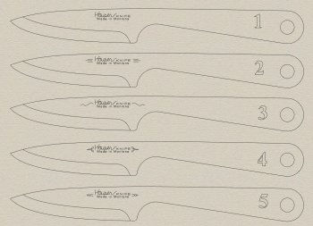
Which logo seems best? two votes max.


  • Total voters
    23
  • Poll closed .

Smallshop

KNIFE MAKER
KNIFE LOGO.jpg

This is a small knife.(6.5 inches) I am going to be electro/chemical etching on this blade. I had originally made up a logo but decided that Ed C. made a bunch of sense about keeping it simple. After reading his take on the makers mark I realized that the blade is a tiny traveling billboard so to speak. With that in mind this is what I have come up with. If you would tell which seems best (and if you want to say why I'm all ears!) Thanks in advance!
 
Ted, I sorta like #4 or #5, the top one appeals to me "IF" I've got to do the etching - it's simpler with fewer lines to mess up. A good electro etch will do amazing details, the more "fine" details, the more chance of a messed up etch. Hey, now you've got your own stencil stuff, you can try them all and see how they etch. Maybe that StencilPro stuff will really work good. Practice on scrap metal until you're getting good results.

Now, one more thing - since this is a "traveling billboard" perhaps rather than having "Made in Montana", you could consider "city, Montana"? That would make it a good bit easier for somebody who had no idea who or where you were to find you and order a custom knife. I just did a search for "hauser knife" and found a couple, but none where you. I also searched for "hauser knife, Montana" and still didn't find you.

Perhaps rather than "city, Montana", your website address would be good? You WANT folks to be able to use the logo on the knife to find you.

Yea, I know - I get a bit long winded sometimes {g}
 
Thanks Ken,

I have locked down the web domain but not yet done anything. My town is so small it's not on most maps so I thought I'd just use Montana on the knife. I think when i have a web presence it'll "hook up" much better.

I guess I could drop the "made in Montana" and just use "Gildford Montana".

Say would you go up a click on 4+5 on the poll thing? I want to see how it ends up working. Thanks.
 
Ted I like 1. I like simplicity though! Ken makes sense putting your town in Montana. I'm still going back and forth with the mark I want to use. Gonna definitely have my last name in it but, still havnt figured the rest of it out.

What did you end up getting for a power supply? I received some of the parts for mine today. Made the marking wand. Still need to get enclosure (tool box) and a couple more components to have everything I need but were closing in on it.
I had already ordered that little ac/dc output power supply. I got the last one and it looks like they won't be stocking any more.

Getting a nice simple mark is more difficult than I thought it'd be...
 
OK Ted, I tagged #4 and 5 as you asked to show they will select. Seems most folks (9 for #1 as I write this) agree with me that #1 is the better choice due to the simplicity of the design.

Have you got your transparency film to print the design on for making template? I went to Office Depot where they'd sell me single 8X11 sheets for $1 each rather than have to purchase a whole expensive box.
 
I taged #4 as far as the embelishment at either end of the name block goes but as has been said, if you want to be located by the logo then possibly replace "made in" with Gildford for positive identification. Would it make the Hauser knife line more prominant if you just had "Gildford MT" under it rather than the full spelling. The same full information with less lettering on the blade.

I would think that most in the US would know it meant Montana ( even if I had to look at the abreviation list to find it - lol)
 
Last edited:
Ted, I like #1. I like the simplicity but I'm biased due to my etching difficulties. I just changed to a stamp which presents its own issues.
 
I voted for #1....simplest of the lot. The only other suggestion I would offer would be to consider using block letter for your name versus cursive...... only in the interest of being easier to read/identify.

It's no secret how I feel about marking blades..... As simple and insightful as possible. If people can't identify the name, or find you, they can't purchase a knife from you.
 
To re-affirm Ed's comment about block lettering vs cursive- GOOD POINT for block letters! When doing electro-etching the cursive has a better chance of not being as clear as block letters. Now, the block letters don't have to be plain block as the "KNIFE" is, there are some nice fonts that will be easier to read and still etch good. Take a look at the etch I posted in another thread (post #5):https://knifedogs.com/threads/etching-marking-and-youtube-overload.47038/
 
The bolder the letters, the better. Especially if you end up doing some final hand sanding / scratch removal after the blade has been etched. Big, deep letter hold the color way better than fine, intricate ones which tend to wash out if you you have go over them with sandpaper. Very often my etch will have some halo or there will be a dark blemish on the blade which doesn't want to clean off and has to be touched up with light strokes of sandpaper. It stinks to have a beautiful etch only to see the color get washed out because you had to do some retouching on the blade.
 
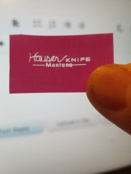
So the most popular was #1....mainly beacuse it is simple/cleaner looking. My wife and I realized that the stylized "Hauser KNIFE" really IS the logo....and adding anything seems to detract. We don't want to go to block letters for that very reason....In the interest of cleaner etching we sized up just a bit. I have hauserknife.com locked down as a domain. I think when I activate that it will be fairly easy to find online. Here's the slightly modified #1.....

knife 10 31 17.jpg
 
The bolder the letters, the better. Especially if you end up doing some final hand sanding / scratch removal after the blade has been etched. Big, deep letter hold the color way better than fine, intricate ones which tend to wash out if you you have go over them with sandpaper. Very often my etch will have some halo or there will be a dark blemish on the blade which doesn't want to clean off and has to be touched up with light strokes of sandpaper. It stinks to have a beautiful etch only to see the color get washed out because you had to do some retouching on the blade.
When i print for the stencil it is about 3 times as fat as the fine lines in the cad doc....shoulda printed and scanned...my bad. I'll do that.
 
knife logo scan 10 31 17.jpg
The print is much cleaner than the scan...I probably have a scan setting off as I do not use it very often. but you get the idea on line weight for creating the stencil....
 
Ken...I printed right on the stencil sheet...the very bottom corner...lol. It fed through fine and printed BEAUTIFULLY!! I am soaking it now and will post a pic in a bit if I haven't screwed up...it's not sunny today so I used an led light?
 
....annnnnnnd the stencil!stencil.jpg
And now for the disclaimers...lol:

1) this is 110 lines per inch...I am definitely going to the high rez...200 lines per inch.
2) I know my exposure is off. I did this under an led rather than bright sunlight.
3) first attempt....

4) it actually does not look THAT bad to the eye. The back light makes it look a bit hazy and I am super zoomed in....

I think my etcher will show up today!I will post some pics of the results.
Btw....the "StencilPro" stencil was super easy to work with!!

Guys...thanks so much for voting...it really made the decision easy!
 
Back
Top