You are using an out of date browser. It may not display this or other websites correctly.
You should upgrade or use an alternative browser.
You should upgrade or use an alternative browser.
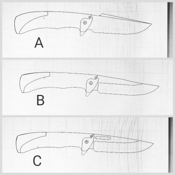
Which design do you like better? Vote
- Thread starter Justin Presson
- Start date
Don Robinson
Well-Known Member
C see?
JeremyBartlett
Well-Known Member
I picked C, I'm assuming that the swedge on A is a false edge? If not it would be very important to have it completely under the frame which would cause your handle shape to get wider than it is in the picture.
Kevin Zito
KNIFE MAKER
A no doubt ... very nice looking IMO ... but they all are honestly
Self Made Knives
Well-Known Member
Man, it's a toss up between A and C for me. Make both!
Daniel Macina
Well-Known Member
I picked c. Really like the flow of that one.
Justin Presson
Well-Known Member
Thanks everyone for checking it out.
Justin Presson
Well-Known Member
John there is something about that one to I like but also know something is not right. I only spent about 10 min on that one and need some input on what it needs.I picked A as they all sit, but B has some real appealing potential with some minor blade tweaks.
They're all nice looking.
Justin Presson
Well-Known Member
Man, it's a toss up between A and C for me. Make both!
Me too....I think both will get made. I made a few slight tweaks to C and I like it even more now.
Von Gruff
KNIFE MAKER
Tilting the plunge line on C might look a bet better?
Yes definately do that. When the plunge line follows the front shape of the handle scales it all flows into a more eye pleasing symetry
mike miller
KNIFE MAKER
I have one question. On C is that an opening oval on top of blade? Why if it is a flipper?
I like A for the design.
I like A for the design.
Justin Presson
Well-Known Member
Yes I agree with you and Von to tilt the plunge. My skills on this program are not the best and I am using the work computer on my 30 min lunch break to cram these in...lolI voted C...but could have just as easily voted A (it's harder to "see" A in 2-D?) All three are good designs...kinda like a friend asking which of your children do you love the best...lol.
Tilting the plunge line on C might look a bet better?
Justin Presson
Well-Known Member
Yes Mike it is. I actually changed the shape of it a bit today but the thought behind it is sometimes you want to be a bit more discreet when opening the knife so you can gently open it with your thumb instead of flipping it open.I have one question. On C is that an opening oval on top of blade? Why if it is a flipper?
I like A for the design.
Justin Presson
Well-Known Member
Thanks I appreciate that! I wish I had my own computer because I think I could get wrapped up for hours making tweaks. This program is fine but sometimes there are little issues I don't know yet that have some limits. I'm sure if I got used to the program I could iron them out.Btw...Justin...I think you have crazy good design skillz...those LINES!!

