Ebbtide
Well-Known Member
I voted for Buddy's photo this week.
Last week he had a killer image as well, but I think this one is way better.
The fringe twigs is such a great touch. Very original.
They all point at the knife.
They add a totally different texture.
They form a warm, dark area contrasted by the cool, light area in the other corner.
All of this keeps the eye moving back to the star in the image... the knife.
I'd give this one 5's across the board.
And oddly enough, I don't like the knife LOL...
I was torn between voting for multiple images or one.
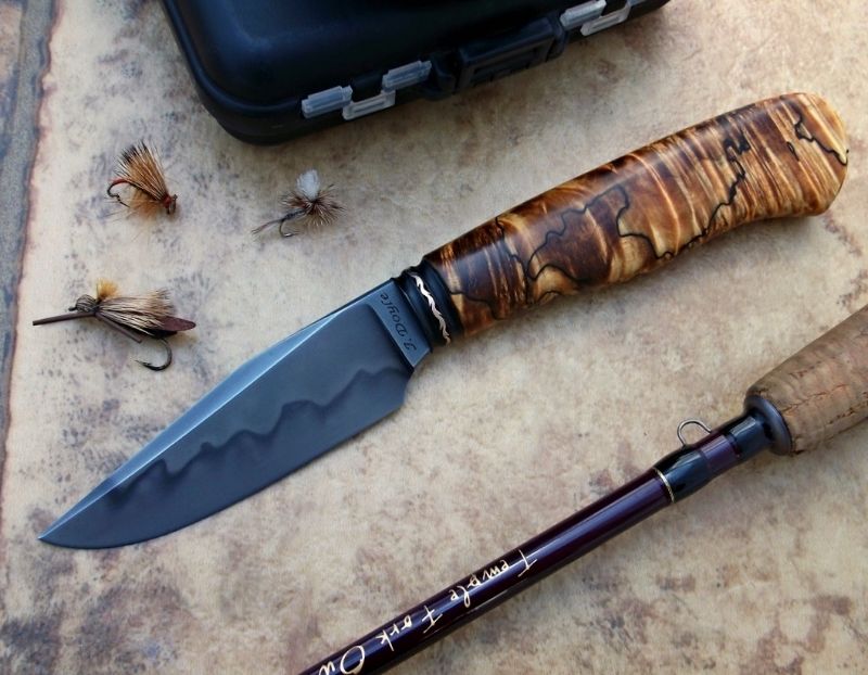
I had Mr Bump's and Mr Doyle's photo checked in the poll as well.
I messed up, deleted Doyle and thought I deleted Bump. But Bruce stuck around and I hit vote.
(If the mods want to fix that, put Mr Doyle in as well, or if we are going with just one vote, remove Mr Bump)
I think those two shots are quite worthy.
The deal breaker for me, and this is a nit, but a worthy one IMHO...That ugly personal taste thing again, but the graphic designer in me wins...
The type in both of those images is upside down.
In Bruce's shot it is the maker's mark. That would've been a killer shot if the knife was pointed up (& its good-er luck) and the type would've been easier to read.
Our eyes and brain are so trained to read type it is a must. When the type is upside down or sideways, it is harder to read, your eye stops to puzzle it out and that puts the brakes on the flow of the image.
Same with the Doyle image, but it is the fishing rod. Turn it the other way around and it'd be much better.
Better yet, use a part of the rod with no type... like the reel seat.
I'd also cram the props closer together and leave out the tackle box... Or stack everything on the box. Right now they are disparate elements... see Buddy's image from last week.
In both of those images I thought the technical bits are really well done.
You know the voting is tough when it is small things like this that decide the finishing places.
Across the board the improvements are showing... getting tougher and tougher

