You are using an out of date browser. It may not display this or other websites correctly.
You should upgrade or use an alternative browser.
You should upgrade or use an alternative browser.
One more makers mark thread
- Thread starter Daniel Macina
- Start date
Daniel Macina
Well-Known Member
John Wilson
Well-Known Member
Either one will look great. I use both an oval mark and a straight. I think there are some knives where one looks better than the other due to where you have to place the mark.
Von Gruff
KNIFE MAKER
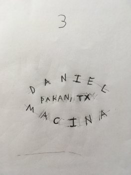
I only scrolled down and saw the 3 for a start and though that is a bit bare as a mark 

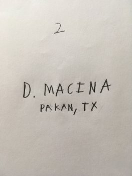
Then I scrolled further and saw the other part of the post. Do you really need your full first name or would an initial work as well to identify you with your surname and location.
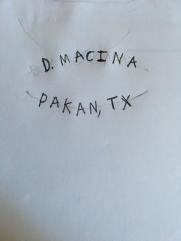
Have you thought of doing the oval form but having D. Macina on the top rocker and Pakan TX on the bottom. Both rows would have 7 letters so it would balance quite nicely and allow for the oval shape while staying uncluttered and work on most blades although if you were doing it in stencils you could have two sizes to suit large and small blades.
chrisstaniar
Well-Known Member
lol, I saw the same thing until the rest of the picture loaded. I was thinking "well, it's a nice sideways butt"
I like the first initial last name thing. That's all I put for my makers mark
I like the first initial last name thing. That's all I put for my makers mark
Motor City Mike
Well-Known Member
#3
Daniel Macina
Well-Known Member
Sorry for the numbers. I had three and was going to number them so it would be easy to vote on but I decided I didn’t like the first one.
Daniel Macina
Well-Known Member
Have you thought of doing the oval form but having D. Macina on the top rocker and Pakan TX on the bottom. Both rows would have 7 letters so it would balance quite nicely and allow for the oval shape while staying uncluttered and work on most blades although if you were doing it in stencils you could have two sizes to suit large and small blades.
I kind of like having the full name but I think it might be a bit much. I will draw it up how you suggested and see.
Daniel Macina
Well-Known Member
Mark Barone
Well-Known Member
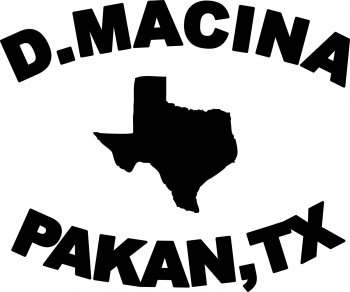
I like the Texas state in the middle idea
Lorne Sieben
Active Member
Kevin Zito
KNIFE MAKER
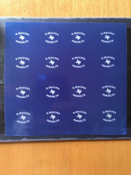
That looks cool.Here's something I whipped up Daniel.View attachment 68520
Daniel Macina
Well-Known Member
Here's something I whipped up Daniel.View attachment 68520
That does look rather cool! Thank you very much sir!
Chris Railey
Well-Known Member
Here's something I whipped up Daniel.View attachment 68520
Sold!!! That is your logo Daniel
John Wilson
Well-Known Member
Here's something I whipped up Daniel.View attachment 68520
That is gold right there. Great job on that.
Daniel Macina
Well-Known Member
@Lorne Sieben can’t tell ya how much I appreciate that. I was still stuck on trying to draw Texas! 
Lorne Sieben
Active Member
Not a problem Daniel.I have a graphic arts program that makes it easily done.
Daniel Macina
Well-Known Member
springer82
Well-Known Member
Not bad,,, Not bad at all. Who made the stencils for you. They did a good job!

