Maker's Mark, Opinions?

LiamLynch

Well-Known Member
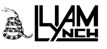
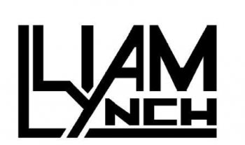
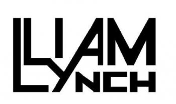
I am going to get hold of some stencils to do makers marks properly and i spent some ridiculous time drawing these, which one do you like best or what should i improve on any of them?
 

Attachments

  • Maker's Mark snake.png
    Maker's Mark snake.png
    14.2 KB · Views: 15
  • Maker's Mark 2.jpg
    Maker's Mark 2.jpg
    13.6 KB · Views: 11
  • Maker's Mark.jpg
    Maker's Mark.jpg
    12.3 KB · Views: 12
Last edited:
I don't know if you can get something a fine as the lines in that snake to come out on a stencil. To be honest, I like the last one best. The middle one looks too busy with the bar under the NCH, it makes it look too much like a half frame around your name.

Doug
 
Honestly, for me they're all kinda "busy", with #3 being the least. What do you think about just leaving the two L's the way they are(one above the other) and leaving off the rest of your name. I think that would look good.
 
I am going to get hold of some stencils to do makers marks properly and i spent some ridiculous time drawing these, which one do you like best or what should i improve on any of them?

Liam,
I am with the first guys on losing the snake, then No3 is my choice but I agree with Don L That it's still to busy. You want to add a little touch of you. Not make it a mind puzzle to read. Try one with the L Y & A disconnected.

It can take awhile to find the right mix. Take your time. My Mark on my knives is my Avatar you see on my post's. I copied the Rhino head off of the slip cover on the Book,
The Covenant by James Michener. Great book if you love to read about history.

Let's see a couple of more?

Laurence

www.rhinoknives.com
 
Honestly, the "Y" is getting lost for me. I cant tell if it is supposed to be part of the upper or lower word at quick glance.
Coming up with a makers mark that will best represent you to the rest of the world is a real tough thing to do.
I havent figured it out yet. Do you have any other ideas that you wouldnt mind throwing out there?
 
I forgot about this thread, it's amazing how much you change your mind when you are new to this game, I don't like any of these now. I want to something that looks professional. Until I get some stencils I think I will just do my name in a fancy font. I am no good at calligraphy though. I will try to come up with something workable tomorrow.
 
Liam glad that you are searching for a different mark. using an oval shape e.g. your name in an arch over and then your home town in an arch under (hence the oval shape) has been an old standby. Look at some of the older guys like Bob Loveless or Morseth. Not that this is what you should do, but rather consider shapes. don't try to be too modern. custom Knife making is a very old and honorable trade.
 
Back
Top