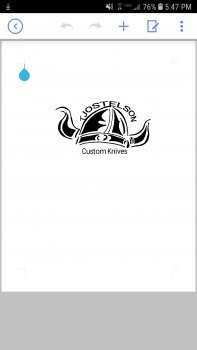
Ok.... So as far as maker's marks go, I'd personally go back to the drawing board.
Can that mark, as is, be made into a stencil? Yes Should it be? In my opinion, no.
For one, in order to actually read your name, it'd have to be a significantly large print, maybe somewhere around 2"x1", which even for a large chef knife would be a HUGE mark. Secondly, you typically should try to avoid large areas of black in your stencil. The black (letters, lines, shading) is essentially what the etcher is going to etch away. The larger the black area, the rougher the etch tends to look. You also have too large of a span of sizes between your details, which makes scaling in either direction an issue. I.E., if you scale your print down, the small details will be lost, and if you scale it up large enough to see those details, you're asking the etcher to do too much for the larger black areas.
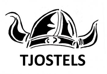
Now if you wanted to put that graphic on a t-shirt, or a shop sign, or even a web page header/background, that might be another option, but I'd seriously consider re-working even still. Right now, I'm not sure what your name is. Is that a "T" in the beginning? Is it supposed to be T. Jostelson? Or is it TJ Ostelson? The curvature of the letters doesn't follow the helmet very well either, and looks sloppily done and stretched out. I'd space the letters more evenly, and make them the same size, and maybe space them away from the helmet some more. I'd also suggest simplifying the helmet a little bit more.
The best, and most iconic logos are dead simple. A good maker's mark should be as well.
Personally, I'd leave logos/pictures for your t-shirts and websites, and just put your name on your knives for your makers mark.
Hope the above doesn't sound too harsh.


