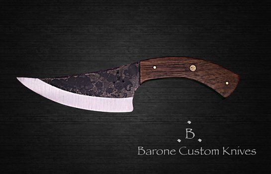
That is actually not bad at all for green screen. Normally with green there is some reflecting or tinting spilling over on to the knife. I struggled with the issue until I remembered that the reason they mainly use green is to avoid losing human skin tones which have the least in common with green. I switched to a neutral gray and have zero issues with the spillover, it may however require a more sophisticated program to isolate the more subtle differences from some of the tones on the knife. I use the most popular software that we all love to hate, and I won’t mention their name because of how much I now despise them, but let me say that I will never use beyond XX6 because I will not be extorted monthly for my own creative property.
Anyhow, here is my advice to make the image even better. For me removing the old background is just the first half of the problem. For me the secret to the second half is getting the subject (knife) to look like it is part of the new background and not cut and pasted. There is nothing that does this quicker than to show that the subject is affecting the back ground in some way, this immediately fools the human brain into believing the entire image is real. The easiest way to do this is with shadow. You can do this in one of several ways but this is the easiest of the one I use-
While the knife is a cutout, create a duplicate of it in black silhouette then slip it behind the subject and enlarge it to the size of your desired shadow, remembering that larger and morse diffuse shadows manes the knife is farther away from the background and smaller, refined shadows put the knife closer to the background. I always offset the shadow to show more on the bottom, because if it is evenly centered behind the knife our minds tend to more easily reject it as legitimate. Next, I apply a heavy blurring filter to the silhouette to diffuse if from a silhouette to a shadow, and then lower its opacity until the background shows through, pulling everything together.
The final touch up is to very lightly blur the pixels along the edges of the subject. If you look at a real image very closely, nothing has clean cut edges, they always interact with the background lighting on some level (hence the struggle with the green spill over). By blurring the edges a couple of pixels in you create that natural interaction with the background, making the image as realistic as possible.
Now, one final bit of good news for those editing videos. That unmentioned company also make a video editor that they use to extort those who were loyal who believe they have no choice. I want to say the answer is here! Check out Black Magic’s Davinci Resolve! I have been using 16 for a while now and it was more than a match for that other company, and you can get it for FREE! But Davinci Resolve 17 was just released and it has blown my mind, in fact it hands down blows that other companies video editor out of the water! And the best part- if you want to take your video work to Hollywood level for about the price of one of your modest custom hunting knives you can own the Studio version FOREVER. Video green screen can be touchier than photo work because the subject continually moves. If you have software that takes a single point sample at a time it can be tedious to get the right balance. In Davinci Resolve you take a swipe across the background and it compensates for the range to give you instant background removal. The first time I did that I said “WOW!” and was in love.


