Makers mark opinion

Justin Presson

Well-Known Member
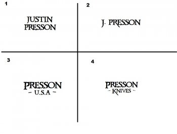
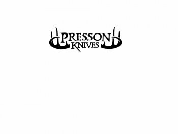
Well I have been thinking about getting a stencil made and buying an etcher. I think this addiction of knifemaking is here to stay for awhile so I thought if I'm going to sell any to help feed the addiction i was advised to put my name on it.

So here are a few I put together and I'm looking for everyone s thoughts good or bad. I grew up with 2 older brothers so my skin is pretty thick :) open to suggestions.
Thanks
Justin
uploadfromtaptalk1400270940867.jpg
 
They all look good but I like #1 best, #3 next, #4 next, & #2 last but only because it may be a bit too wide in some places. Although that will depend on actual size.
 
The Late Bob Loveless said, Put your full name & town. These days full name & website would work too.

My Avatar is my knife logo just for an example.
 
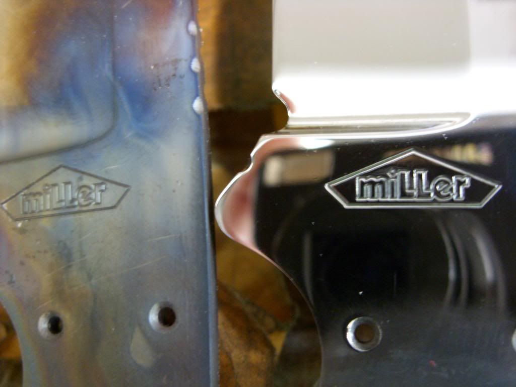
I like #2 myself. take your time with this because what ever you use you may be using for a long time. just your last name with your city and state under it might look good to. also some kind of logo design along with your name will make it more recognizable and one of a kind. my last name is Miller and there's a few other Miller knifemakers out there, so my logo is out lined with a sort of pentagram to make it un mistakeable.
 
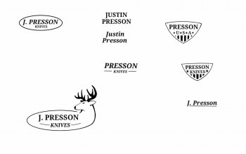
I'm kind of leaning to #3 but I still don't know I had another one drawn up with some deer antlers on it but thought it was to much. If I can find it i will post it

Sent from my SPH-L720 using Tapatalk
 
I like #2 myself. take your time with this because what ever you use you may be using for a long time. just your last name with your city and state under it might look good to. also some kind of logo design along with your name will make it more recognizable and one of a kind. my last name is Miller and there's a few other Miller knifemakers out there, so my logo is out lined with a sort of pentagram to make it un mistakeable.

+1 for me
 
I also suggest that you get more of a solid font for your type style. that kind of font is more likely to haze and halo.
 
I worked up a few more see what ya think. I tried to keep it simple then I got carried away on a couple :D
uploadfromtaptalk1400690022734.jpg
uploadfromtaptalk1400690047855.jpg
uploadfromtaptalk1400690068139.jpg

I kind of like the last one just because I'm a hunter and it fits me. I'm off the rest off the day time to go work on some knives.
Justin
 
#2 is best, with #1 a close second. #3 is fine too, but I don't care for #4 (we know you do knives already if the mark is on a knife!). The purpose of the maker's mark is to provide a random person who encounters it with enough info to find you. Anything else (IMHO) is superfluous. This is not the space to make a statement (do that with your knife designs and by the quality of your execution). I prefer just the last name, personally, but in my case there are at least 4 other Fry knife makers (2Bs, 1C and 1J) so I included my first initial (there are no other Ts) to differentiate myself. This might not be an issue for you. I also like to keep mine as versatile as possible so that I don't have to change it. I my case this means NO reference to my location, since I've moved 5 times in the 5+ years I've been making knives and will likely do so again. I'd suggest looking at the MMs of people whose work you respect/consider to be at the top of the game. With only rare exceptions you'll see just the name, clearly presented without any bling.

Your font and layouts are very good--far better than most marks I see here. Any of them you pick will serve you well, I think, but you did ask for opinions...

Edited to add: I think ALL of your first 4 are better than ANY of your new ones.
 
Last edited:
I hear what you are saying I have gotten the same advice from another maker and I am starting to come around to the idea of just a name that is simple. You hear a lot about marketing and branding so I thought a logo would be better. I see a ton of real tree and browning buck stickers in the back glass of trucks and i see those guys as my target customers. Thought it might be neat to have some window decals made up and include with the purchase of a knife. Heck I have a hoyt bows decal along with a ruger firearms in my back glass...I'm kinda redneck though :). All food for thought. Thanks for the feedback Travis
 
My wife (who designs logos and websites and print advertising for a living) and I had the same discussion last week about whether the MM should be/match any other branding materials (fonts, logos, websites, etc.). It came up because I was finally ordering some new MM stencils from IMG based on the principles I mentioned earlier. Our conclusion was that while the MM CAN match the logo and whatnot, it serves a different purpose and therefore isn't required to.

The purpose of the mark is, as I mentioned above, and in my opinion, to provide enough info that a person looking at the knife can find the maker. Usually this is a name, or location if required (unless you're Don Hanson III). It need not serve the purpose of advertising; the person who would need to find the maker based on the MM is already attracted enough to the knife to want to find out who made it. Logos and websites and decals and business cards DO serve the purpose of advertising (i.e., getting people to look at and hopefully buy your knives), and should all be subjected to the same stylistic parameters (font, color, layout, etc.) in order to preserve and promote recognizability and brand integrity. I think the style and execution of your knives also serves an advertising purpose in that they, too, serve to promote recognizability and brand integrity.
 
Last edited:
#2 and #3 are the best IMO, i think that a logo or makers mark should be simple and not take too much attention from the knife itself.
 
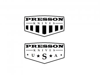
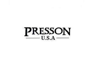
I think I like this the best. I still need to tweak it and maybe change the usa font to the same as my name but I did clean up my name font and made it less ragged because of concern it would not look intentional.

uploadfromtaptalk1400794666392.jpg
 
Back
Top