You are using an out of date browser. It may not display this or other websites correctly.
You should upgrade or use an alternative browser.
You should upgrade or use an alternative browser.
Logo Critique (If wrong forum, please move)
- Thread starter h0tr0d
- Start date
Travis Fry
Well-Known Member
While that looks cool at that size, it'll be nearly impossible for it to etch cleanly at maker's mark size. In my opinion, it's also WAY too busy. The KISS principle applies to logos and marks just like everything else. The absolute best, sure fire, can't fail way to make something easy to identify is to use your name.
Steven Long
Well-Known Member
I don't think the tree of life would etch very good. Too busy as Travis stated. I would just go with your full name. Think simple when it comes to small stencils.
rhinoknives
Well-Known Member
Chris,
I agree with the previous comments. Try a less busy tree possibly, look at Boker brand from germany, Look at my logo and the logo of other makers that are much more successful than me for ideas as well. Just your name in a stylish but easy to read font is always a winner to me as well.
There are many people with the last name Ford and I don't think people would immediately think of Ford Motor Co.
Knifemaker.ca
Dealer - Purveyor
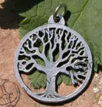
I think it's important that a logo helps someone identify you when they don't have a clue. I just googled 'arbour vitae' and even "arbour vitae knife" and found pages of nothing relevant. While I agree that the tree won't etch well, there are coarser renditions that should - like;
For my logo, on the few knives I make these days, I use a football shaped "Ranger Original" - "Alberta Canada".
I think a google search will find me.
For the supply business I used our website URL and the Canadian Flag that shoppers up here look for when shopping on line.

Again, people will be able to find us.
I'm no expert on graphics or marketing, but I hope my thoughts might serve yours too.
Rob!

For my logo, on the few knives I make these days, I use a football shaped "Ranger Original" - "Alberta Canada".
I think a google search will find me.
For the supply business I used our website URL and the Canadian Flag that shoppers up here look for when shopping on line.

Again, people will be able to find us.
I'm no expert on graphics or marketing, but I hope my thoughts might serve yours too.
Rob!
Knifemaker.ca
Dealer - Purveyor
That's cool - but you'll need to explain what it has to do with your knife making. Are they made to weather what destroyed everything else? Do they represent a new beginning from a failed past?
It's still going to be tough when someone sees that knife they really like - to track it back to the maker.
It's still going to be tough when someone sees that knife they really like - to track it back to the maker.
Drew Riley
Well-Known Member
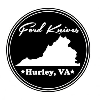
I might even simplify past that, and remove the state silhouette.
Ford Knives
Hurley, VA
Or, even just a first name last name, or first initial last name, then where you are from, would be more than enough to narrow things down for the average customer.
As for the more elaborate ideas, they can be used for business cards, websites, avatars, etc...
On some knives I make, I just mark my first initial, last name, and the steel type.
View attachment 46825
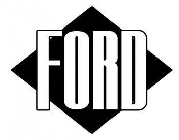
Taking input from what you all have said and now shifting towards something like this...same still goes, comments, concerns, criticisms welcome!
I personally like the simple 'Ford Knives' in this example. It is simple, clean, and classy. My mark is simply my three initials, but then I'm not too worried about becoming the next Randall, or Loveless....
Dennis Morland
KNIFE MAKER
If you go with a simple name . . . "Ford Knives" --- think about adding something like "Ford Custom Knives" or " Ford Handmade Knives". The reason I say this is that Ford (Cars/Trucks) gives away promotional knives from time to time. Just google "ford knives". By adding the word "custom" or "handmade" you may set yourself apart just a little bit. Not much - but a little.
Drew Riley
Well-Known Member
If this is for etching, keep in mind that really small details OR large solid areas get harder to make look right.
For instance, I'm not sure how well the black diamond will come out ob an etch.
Sent from my iPhone using Tapatalk
For instance, I'm not sure how well the black diamond will come out ob an etch.
Sent from my iPhone using Tapatalk
rhinoknives
Well-Known Member
View attachment 46825
Taking input from what you all have said and now shifting towards something like this...same still goes, comments, concerns, criticisms welcome!
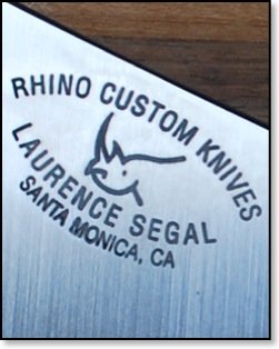
That looks fine and should work well. My logo on my avatar is what I use on my knives, biz cards and anything else I want to put my knife brand & name on. Have one made and test it out.
Here is what I have on my blades.
Last edited:


